vintage sign write my bus?!? should I or shouldnt I?!?

Early Bay Forum

Help Support Early Bay Forum:

This site may earn a commission from merchant affiliate links, including eBay, Amazon, and others.
cheers boys! of course it wouldnt look anything like this finally...but it gives the idea...

vansign6.jpg
 
wowsers went into paint to have a play (hope you dont mind) and loads posted why i was doing it lol

me i'd drop the services, especially outside the slash under neath as it looks more like a title for the contact details.

Also id put the web/tel on one line.

Id never be able to create stuff like this from scratch but tried editing yours :msn4:

Untitled-1.png
 
thanks for doing that nugsy! i like the one line idea!

u said that the services looks like a heading.... do you think i should list the services i offer?!?

editorial
press
publicity
landscape
fine art
wedding

?!?
 
maybe leave the sides with the basics so its big and bold and noticable, you could always list the actual services on either side of the rear hatch lock. (but guess the back needs a smaller version of the sides really as with bus's its maybe the bit others see most when stuck behind us :lol: )

me i'd keep it clean and neat and to teh point :)
 
im no expert but like to comment on what i see.

for me has to be photograPHY but join the end onto the Y
so its the Y that sweeps back (if you get me)

And yep, think it would suit ya bus luverly !

cheers
d
 
I go with the general consensus above and think that would look really good.

I was going to ask what market you were going to target, but seeing your list above and imagining you are going to be taking the plunge and doing if for a living, you'll be wanting to pimp yourself to anyone who wants photgraphic work undertaking. Don't get me wrong when I ask this but maybe think about it the other way. Turning up in a sign written bus as your work vehicle would this put anyone off? I would go for who I liked and who provided the best photos and price I guess and to me someone turing up in your bus would be an added attraction, it would set you apart from the others too. But we've all been at weddings lets say, where the photographer is pretty safe, probably drives a ford mondeo or something and the people paying the bill feel safe with him or her. Get my drift?? The parents are picking up the bill, so will probably have a say.....

I suppose you could always borrow someone elses car ;)

As I say just a thought and the positives would outweigh the negatives IMO. I work in construction generally on nice expensive houses and one or two schools and I know how certain clients think. Certain people I wear a suit to go and see and others I am happy to turn up in a shirt and jeans (obviously my preference) and they're not bothered at all. I very rarely wear a tie though :)

Don't know if that helps or not. Good luck with it either way.
 
thanks for the advice matt! you think similarly to me.... but although i want to use the bus as a bit of free advertising i would rarely turn up to a client in it!!! firstly it costs too much to take on long journeys and secondly i wouoldnt want to break down on the way!!! especially if its a wedding!!! :lol: my bus wont be a daily work horse, but i may use it for a shoot on the odd occasion.... other than that its my lurvely yellow fiat punto!!! :msn4:

also similar to yourself, some clients i need to be suited and booted where as others are more casual!

basically ive always wanted a sign written bus so now i have a genuine reason to do it.... and the added advertising cant be anything but a bonus!
 
That makes perfect sense and glad you took it the right way. Enjoy the punto, good little car, we had one. Good luck again
 
Hi Jon

Neil's been away so I'll answer your pm questions for you...All supplies available from http://www.handover.co.uk" onclick="window.open(this.href);return false;

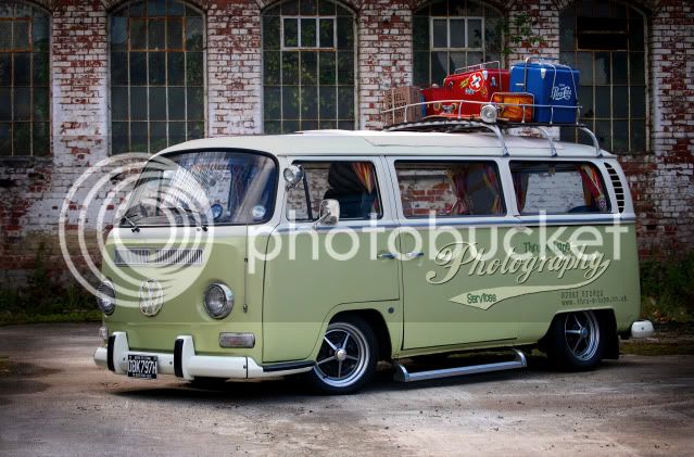
1-Shot lettering enamel is what you need....by the looks a tin of Ivory, Black and Dark Green...they are about £6- £12 each depending on colour

get yourself two decent Pure Sable chisel Writers [brushes] a size 4 and a size 8......when painting larger letters try and use as big a brush as poss as the paint flows out and you will pull nicer smooth lines...rather than looking dabbed.

buy a stabilo pencil to help markout [leaves no marks]

we thin the paint with white spirit....we use the consistency of single cream...but probably easier as a novice a bit thicker. Expect to second coat the cream, leave a day before recoating.

Get a large peice of tracing paper and draw you design up....position on vehicle and transfer onto bus by charcoaling the back and drawing over with pen...this will get it the same both sides.

As a beginner do one colour a day....then if you have to wipe back you won't wipe off what you've already done.

clean brushes with white spirit..then grease with oil, vaseline or neatfoot,....before using again clean thoroughly with white spirit again..or paint will fish-eye.
degrease bus with meths before starting

leave a week before fatiguing..and t2d are the experts on that

good luck
 
Go for it.

Seriously thinking of doing exactly the same thing to our Bus the Panzerfaust.

Would like Camper&Bus Magazine on it somewhere so people can see that we actually drive it to shows and that...

Now it's down on the Fuchs it looks killer too so some logos would be the cherry on the cake.
 
pinstriper said:
Hi Jon

Neil's been away so I'll answer your pm questions for you...

hi...i presume this is mandy?!? thanks for all your answers to my queries.... it a great help, especially with how to get the design transferred onto the the side of the bus..... that idea wouldnt have occured to me!!!

thanks to everyone else for their positive feedback too..... it was a bit of a shot in the dark and i half expected most to say DONT DO IT!!!!! even my dads into it!!!!

well watch this space....

btw... james... definitley the icing on the cake..... go to it...and if you dont like it... im sure the mag will buy you another bus?! :lol:
 
Hi my wides a designer, and she thinks photographic services sounds better and prefers the placement of design number 2 more. She said any help just pm me and she get help you get What you want. Hope this helps jamie&mel
 
okay... have worked out a couple of final designs...

cant decide on the colour of the heading as i like green as it goes with the design and colour of the bus....
but jon mentioned red sits quite weel with the light green too!!! and it does!

might also go for a plainer text for the web and the phone number...

vansignfinal1.jpg


vansignfinal2.jpg


much more stylised and thicker than that first few.... pretty happy with them!

:mrgreen:
 
also considering doing a bit of a a faux patina on the whole bus... kind of in keeping.....
im sure the purists will be raising a few eyebrows out there!!! :msn4:
 
Hi Jon

My only comment would be that I think the script text has gone a bit too 'heavy' and the letters are now blurring into each other a bit, I think you need to be somewhere between the original weight and the latest one you have shown. I like the red text and agree the phone number should be in an easy read font such as Arial or Tahoma.

(PS I trained as a Graphic Designer so hope you dont mind the comments)
 

Latest posts

Top